HDR Architectural Firm- 15 Iconic Projects

Having an extensive portfolio with projects in over 60 countries, U.S based firm HDR has designs that captivate, ranging from macro-scale urban design alterations and realms of specialized design and research. HDR has made an impressive footprint in all 50 U.S states. A global network with over 10,000+ employees, HDR has a unique design signature, yet manages to blend in by function and a simple, approachable design sense. The following are 15 projects that every designer should know, by design giants HDR.
Also Read:- Most Famous Public Squares of the World
1. Chengdu Transit-Oriented Development Planning & Station Designs
In the populated region of Chengdu in China, a metro expansion system required the reworking of the urban strata instead of its transit system, stretching almost 2500km through the city.
As the focus was on adopting transit-oriented development strategies, congestion, and the test of traffic in developing regions of the area were a prime concern. The design proposal reconfigured the existing “superblocks” to more navigable lanes, reducing congestion successfully.
Using a hill-valley design approach, the taller buildings accommodate in the periphery, while lower buildings accommodate the center, preserving the density of the district. The design also adopts green and solar roofs, for a net-zero design approach.
2. Pittsburgh International Airport Terminal Modernization Program
As the activity in PIA changed and needed a major upgrade and addition, HDR proposed a design that acted as a retrofit.
Moving through a traffic analysis phase streamlined the design with a major upgrade in infrastructure and facilities. With an X-shaped building integrating a massive origami shaped roof and a pitched roof semblance in the entrance lobby, PIA gets integral designed rejuvenation spaces, along with interior gardens and skylights that flood the airport with abundant daylight. The airport also has an upgraded parking facility for 3500 cars and the ability to merge a light rail transit system, with the possibility of future upgrades.
3. UCSF Benioff Children’s Hospital Oakland Pediatric Outpatient Center
Using the exterior façade as a canvas, HDR paints a mosaic-like surface which is a threat to children’s and adults’ eyes with a certain playfulness in this children’s hospital. With specialty zoning and interior finishes, the design appeals to the user pool with design modifications and custom anthropometric furniture. Sourcing local artwork for supergraphics, the interiors of consulting rooms are colorful and friendly.
As wayfinding was a necessity in a children-friendly hospital, rooms have been allocated with colors and symbols, and access made easy using a central spine for less confusion. The exterior of the building revitalizes the neighborhood while being a cornerstone of building design in a sober part of Oakland.
4. Kolos Data Center
In the epicenter of the study of green and sustainable energy, Norway, KDC is set in a massive 6 sq. km site. Located at the edge of a fjord embraced by mountains, the built form assumes the movement of glaciers down a mountain and other alluvial plains that are displaced.
Referencing the copper mining history of the place, the central spine is clad with copper, as well as a subtle hint to it being a data center. Functioning wholly on hydropower and producing almost 2 gigawatts of consumable renewable energy, the center is an ode to Norway’s attempt to spearhead clean energy as well as act as a gateway to a public waterfront promenade, in a picturesque image.
5. Healing Spirit House
Taking cues from the healing and perceivable design of Alvar Aalto, Healing Spirit House aims to treat youth from ages 12-17 with significant psychiatric and difficulties in behavior with a tranquil mental health facility.
Focusing on program spaces along with secure gardens and recreational zones within the structure, the facility uses bright blurbs of color to define spaces, and clean-cut lines along with built plane to plane relations in certain rooms. With clear, wide corridors and inviting spaces, HRD is successful in mimicking the aura of a house, considering the comfort of the user.
6. Virginia Center for Behavioural Rehabilitation
Image Sources: The facility uses nature as a soft barrier ©www.hdrinc.com
In an unorthodox design approach, this rehab center sheds the standard direct supervision model, offering a greater conducive approach towards behavioral & mental health.
Using the large 21 sq.km facilities, the design includes breakout spaces, interesting colorful buffers, and living units to practice daily living skills. The spatial planning and organization matrix ensures each area is designed by the behavioral complexity and the imminent transition into community living. Voluminous spaces and play areas help residents to transcend in a methodical sense, through design.
7. University of Montana W.A Franklin College of Forestry and Conservation
Deconstructing the ever-popular concept of a tree, the WACFC is a multi-storeyed ensemble of three fundamental elements of architecture, the wall, slab, and beam, to create a honeycomb structure resembling a tree.
The spatial planning divides the center into a core for research and teaching, while the perimeter is transformed into work “cells”, creating a modular interior. The subtle inclusion of technology allows transient spaces to act as thermal buffers and windows changing chroma with sunlight exposure. The structure also boasts a relatively new concept of carbon balancing, minimizing its footprint, and increasing the building’s life cycle.
8. AIR 5428 Pilot Training System
Born from the aerodynamic curves of flight, the PTC aims to introduce advancements in flight training along with an elegant design. Using clouds of white and stark black lines, the structure is one of contrast.
The amoeba-shaped building consists of a central courtyard, skirted by simulation classrooms and spacious, wide corridors that face the simple treatment of green at the core. Adjoining a hangar and an expanse of open land, the upper floor consists of seating and a view into the canvas that is the open sky.
9. Westmead Hospital Redevelopment
Designing the largest trauma care center in Sydney, HDR uses horizontality to create a spine and vertical slabs of concrete and glass for services and comprehensive care.
Using the extension of land efficiently, a plaza for movement and repose is created, leading to a massive main entrance and double-height lobby, the glass frontage allowing daylight to stream in. Using the central spine for movement, activities are stacked on either side for mobility and identification, while creating an interesting prelude of the landscape for a primarily introverted space, making it innovative yet striking.
10. East Vancouver Integrated Health and Social Housing
With a new take on mixed-use development, the IHSC provides affordable rental homes, as well as a treatment withdrawal center.
Developed as a response to the housing crisis and health care needs of the community, the structure is a rectangular mass with gardens chiseled out mid-height, creating an open, monitored garden space within the facility. The rooms and consultation areas are stacked to maximize occupancy, creating areas of respite within the structure for groups that need constant supervision.
11. Santa Fe Drive Streetscape Design
Attempting to restructure the road planning and streetscape design of a culture-rich neighborhood, HDR aims to let the community design in this placemaking matrix exercise.
The big idea was to widen the street and add furniture and “parklets”. After using the urban design standards for pavement design, accessibility, and making the area more pedestrian-friendly, the community creates asphalt art and throws punches of color to break the monotony of the street.
Corners are treated as nodes and ‘activated’ by giving function and a repeat node mid-block to arrest the eye of the user, making the street more interesting with the extroverted, colorful activities.
12. Advocate Aurora Health Forward Triage Surge Tents
Responding to the global health crisis during the COVID-19 pandemic, HDR collaborates with AAH to fabricate rapid response clinics from March 2020.
Using quick manufacturing and assembling techniques, structurally secure, portable partitions are created to make ‘bays’, for separating caregivers and patients. Mechanical functions are integrated within the temporary structure.
The typical design included a small waiting area moving into corridors where patients are kept isolated, and service areas at the back, making it an essential cog in the local healthcare system.
13. 1075 Pandora
Trying to meet the huge demand for rental accommodations, 1075 Pandora creates a stacked block that pushes circulation activities to the exterior, creating more usable space inside and encouraging community living.
A landmark structure, the exterior consists of the staircase and common areas, all treated with a strong blue tint that catches the eye. A glazed atrium connects all units, while common areas flow into this space to encourage interaction among the 136 rental units.
14. HDR Global Headquarters
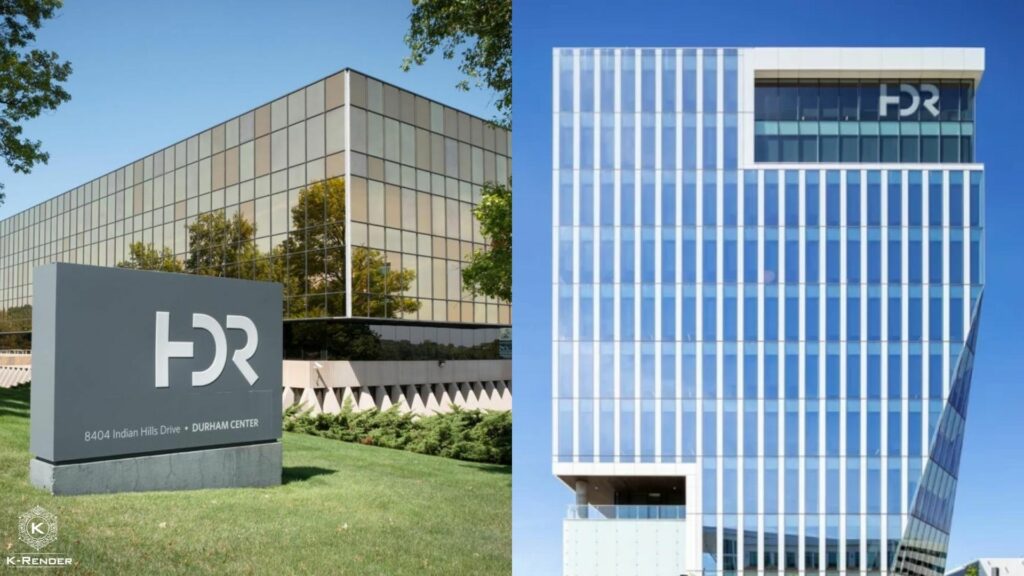
As an opus to their clean design and elegant material use, HDR’s headquarters incorporates a unique form created by the chamfering of a large block, activating functions at a pedestrian level.
Using a glass exterior, an abundance of daylight is achieved, creating visual connections from the pathway to the structure. Cutouts on the structure accentuate these frames, while energy-efficient systems give the building a LEED rating. Using technologically advanced design decisions, structural material was saved up to 68% and increased energy reduction.
15. Novartis Australia Headquarters
Using a contrasting palette of timber and aluminum, Novartis HQ symbolizes the relation between science and human-centric design. This concept is further emboldened by merging straight lines and curved timber forms to create an interesting structure.
The wooden finish of the interior manages to transcend beyond the building the feeling of warmth, while the transparency is synonymous with Novartis’ culture. The spaces include a flow between the formal and informal, the visual connect encouraging interaction between colleagues.


