The Art of Falling: Exploring Google Gravity

Google Gravity: A Complete Introduction
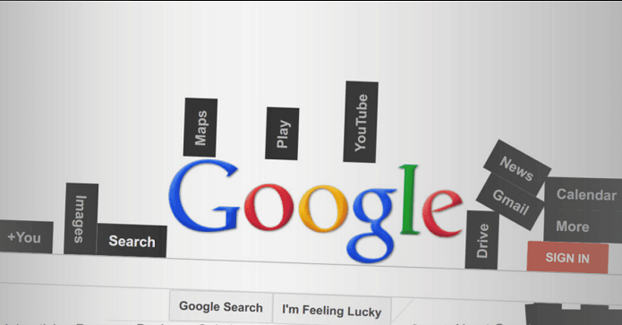
Overview: Google Gravity is a project developed by Ricardo Cabello, also known by the moniker “Mr. Doob”. This interactive project is a part of a series of browser-based experiments that playfully reimagine how users can interact with web interfaces. At its core, Google Gravity takes the familiar appearance of Google’s homepage and applies a ‘gravity’ effect, causing all the elements on the page to fall downward, as if subjected to the Earth’s gravitational pull.
Origin: Mr. Doob, a talented programmer and artist, created Google Gravity as part of his ongoing series of web-based experiments. These experiments challenge and reimagine typical web interactions, often with a touch of whimsy.
Functionality: When users visit the Google Gravity site, they’re first presented with what looks like the standard Google homepage. However, within moments, every element on the page, from the search bar to the buttons, starts to tumble to the bottom of the screen. The effect mimics what might happen if gravity suddenly pulled on the webpage.
Beyond this initial fall, the elements remain interactive:
- The search bar can still be typed into, although it’s trickier as it’s no longer fixed in place.
- Clicking on the “Google Search” button after entering a query will cause search results to cascade down, obeying the rules of this gravitational world.
- Even the clickable links remain functional, leading users to their expected destinations, albeit from a jumbled, gravity-affected layout.
Technical Details: Google Gravity is built using JavaScript, particularly leveraging the Box2D physics engine. This engine is responsible for the realistic movements and interactions of the page elements as they fall and collide.
Extensions and Variants: Following the popularity of Google Gravity, Mr. Doob and other developers have created various spin-offs and similar experiments, such as “Google Sphere”, where page elements orbit around a central point, and “Google Water”, where the interface appears submerged underwater.
Reception and Impact: Google Gravity quickly became a viral sensation upon its introduction. It’s been celebrated as a creative fusion of art and technology, turning a familiar interface into a playful digital sandbox. While it doesn’t have practical applications in the traditional sense, it serves as a reminder of the web’s potential for creativity and unexpected user experiences.
For educators and tech enthusiasts, Google Gravity can also act as a conversation starter about physics, web development, and the intersection of technology and art.
Interactive Experience of Google Gravity
Google Gravity isn’t just a visual marvel, but it’s an interactive playground that turns the conventional web browsing experience on its head, quite literally. Here’s a closer look at the interactive facets of Google Gravity:
- Initial Reaction: Upon entering the Google Gravity page, the immediate spectacle is seeing the familiar Google homepage elements suddenly succumb to a virtual gravitational pull, crashing to the bottom of the browser window. This unexpected twist often elicits reactions of surprise and amusement from first-time viewers.
- Manipulating Elements: After the initial fall, users can click and drag various components around the screen. Want to fling the Google logo or toss the search bar around? Google Gravity lets you do just that, with each element responding as if it were a physical object affected by gravity.
- Typing in the Search Bar: The search bar, despite being affected by gravity, remains functional. Users can type into it, but it’s a unique challenge given its lack of a fixed position. Typing becomes a playful task as you might need to chase the search bar a bit or type sideways!
- Searching: After entering a query and hitting ‘Search’, results don’t appear in the traditional list format. Instead, they cascade down from the top, piling up haphazardly, much like the rest of the elements affected by the gravitational pull.
- Interacting with Search Results: Each search result, though jumbled and piled up, remains clickable. If you can navigate the disarray, you can click on any link, and it will lead you to the intended website.
- Playing Around: The real fun of Google Gravity lies in the experimentation. Toss elements around, see how they interact, collide, and settle. The physics engine ensures each interaction feels tangible, making the digital space momentarily feel like a physical sandbox.
- Repeated Interactions: Even after everything has settled at the bottom, any movement, whether from the user or even resizing the browser window, can cause elements to jostle, shift, and tumble again.
- Browser Compatibility: Google Gravity’s interactive experience can vary slightly based on the browser used. It’s optimized for modern browsers that support advanced JavaScript functionalities.
- Mobile Experience: On mobile devices, the experience is a bit different given the touch interface. Pinching, zooming, or swiping can have unique effects on the gravity-driven elements of the page.
- Exploring More: If users are intrigued by Google Gravity, they often find themselves exploring other projects by Mr. Doob, each offering its own set of interactive quirks and surprises.
Conclusion: Google Gravity stands as a testament to the boundless creativity the digital space offers. It transforms the mundane into the unexpected, providing users with a delightful break from the norm. As web technologies continue to evolve, projects like Google Gravity inspire developers and users alike to reimagine the boundaries of what’s possible online.
In essence, Google Gravity takes a familiar digital space and turns it into a realm of playful discovery. It’s a testament to the potential of the web not just as a space for information but also as a canvas for creativity and interaction.


